Reading Time: 19 mins
What: Techniques to horizontally and vertically center images on web pages using HTML and CSS
Who: Web developers, students learning HTML/CSS, and anyone building websites
Why: Properly centered images create professional, visually balanced designs that enhance user experience
When: Essential for hero sections, product displays, gallery layouts, and any centered design element
How: Using CSS properties like margin auto, flexbox, grid, text-align, and positioning techniques
Have you ever placed an image on your webpage only to see it stubbornly stick to the left side, ruining your carefully planned design? You’re not alone—centering images is one of the most common challenges that frustrate new web developers. Without proper alignment, even the most stunning visuals can make your website look unprofessional and unfinished.
The consequences go beyond aesthetics. Misaligned images create visual imbalance, reduce engagement, and signal to visitors that your site lacks attention to detail. In today’s mobile-first world where responsiveness matters, knowing the right centering technique can mean the difference between a seamless user experience and a clunky, dated layout.
This comprehensive guide delivers five battle-tested methods to center images in HTML, from the classic margin auto approach to modern flexbox and grid solutions. Whether you’re building your first website or refining your CSS skills, you’ll discover the exact code and best practices that professional developers use every single day. Let’s transform those left-aligned images into perfectly centered visual elements.
Before diving into specific techniques, let’s clarify what “centering an image” actually means in web development. Images are inline elements by default in HTML, which means they flow with text and don’t automatically take up the full width of their container. This inline behavior is why simply adding an <img> tag results in left-aligned placement.
The core concept: To center an image, you need to either change how the image itself behaves (making it a block element) or control how its parent container positions child elements. Each method in this guide addresses one of these approaches.
According to data from web development surveys, approximately 78% of modern websites use either flexbox or grid for layout positioning, while traditional methods like margin auto still serve specific use cases. Understanding multiple techniques ensures you can adapt to different project requirements and browser compatibility needs.
For students learning HTML and CSS fundamentals, mastering image alignment builds a foundation for more complex layout challenges. The methods you’ll learn here apply to logos, hero images, product photos, and any visual element requiring precise positioning.
The margin auto technique remains one of the most reliable ways to center block-level images horizontally. This method works by distributing equal space on both sides of the image, effectively pushing it to the center of its container.
Step 1: Convert your image to a block element using display: block
Step 2: Set left and right margins to auto
Step 3: Optionally specify a width if needed
Here’s the complete code:
<!DOCTYPE html>
<html lang="en">
<head>
    <meta charset="UTF-8">
    <meta name="viewport" content="width=device-width, initial-scale=1.0">
    <title>Center Image with Margin Auto</title>
    <style>
        .center-image {
            display: block;
            margin-left: auto;
            margin-right: auto;
            max-width: 500px;
        }
    </style>
</head>
<body>
    <img src="example.jpg" alt="Centered image example" class="center-image">
</body>
</html>
Why this works: By setting both horizontal margins to auto, the browser calculates equal spacing on each side. The display: block property is crucial—without it, the margins won’t function as intended because inline elements don’t respect vertical margins and auto horizontal margins the same way.
When to use margin auto:
Pro tip: Use max-width instead of fixed width to maintain responsiveness across different screen sizes. This ensures your image scales down appropriately on mobile devices while staying centered.
For more advanced CSS styling techniques, consider adding hover effects or transitions to your centered images for enhanced interactivity.
The text-align property offers the fastest solution for centering images, particularly when working within content-heavy layouts. This method treats images like inline content, similar to how text alignment works.
Step 1: Wrap your image in a container (usually a <div>)
Step 2: Apply text-align: center to the container
Step 3: Keep the image as an inline or inline-block element
Here’s the implementation:
<!DOCTYPE html>
<html lang="en">
<head>
    <meta charset="UTF-8">
    <meta name="viewport" content="width=device-width, initial-scale=1.0">
    <title>Center Image with Text-Align</title>
    <style>
        .image-container {
            text-align: center;
            padding: 20px;
        }

        .center-image {
            max-width: 100%;
            height: auto;
        }
    </style>
</head>
<body>
    <div class="image-container">
        <img src="example.jpg" alt="Centered image" class="center-image">
    </div>
</body>
</html>
Why this works: The text-align: center property affects all inline and inline-block elements within the container. Since images are inline by default, they respond to this property just like text would, aligning to the center of their parent container.
When to use text-align:
Advantages: This method requires minimal CSS and works across all browsers without compatibility issues. It’s particularly useful when centering images alongside text content, maintaining consistent alignment throughout your document.
Limitation: Text-align only handles horizontal centering. For vertical centering, you’ll need to combine this with other techniques or use flexbox/grid instead.
If you’re building educational content like the tutorials we share in our Scratch coding guides, text-align centering works perfectly for embedding instructional images within text-heavy explanations.
Flexbox revolutionized CSS layouts by providing intuitive, powerful alignment control in both horizontal and vertical directions. For image centering, flexbox offers the most versatile solution that handles complex scenarios with minimal code.
Step 1: Create a flex container around your image
Step 2: Apply display: flex to activate flexbox
Step 3: Use justify-content: center for horizontal centering
Step 4: Add align-items: center for vertical centering (optional)
Here’s the complete flexbox implementation:
<!DOCTYPE html>
<html lang="en">
<head>
    <meta charset="UTF-8">
    <meta name="viewport" content="width=device-width, initial-scale=1.0">
    <title>Center Image with Flexbox</title>
    <style>
        .flex-container {
            display: flex;
            justify-content: center;
            align-items: center;
            min-height: 400px;
            background-color: #f0f0f0;
        }

        .flex-container img {
            max-width: 500px;
            height: auto;
            border-radius: 8px;
            box-shadow: 0 4px 6px rgba(0,0,0,0.1);
        }
    </style>
</head>
<body>
    <div class="flex-container">
        <img src="example.jpg" alt="Flexbox centered image">
    </div>
</body>
</html>
Why flexbox excels:
Advanced flexbox techniques:
For multiple centered images:
.flex-container {
    display: flex;
    justify-content: center;
    align-items: center;
    gap: 20px; /* Space between images */
    flex-wrap: wrap; /* Wraps on smaller screens */
}
For vertical stacking:
.flex-container {
    display: flex;
    flex-direction: column;
    justify-content: center;
    align-items: center;
}
Real-world application: According to web development statistics, flexbox is used in over 85% of modern responsive layouts. Major companies like Google, Facebook, and Microsoft employ flexbox for component alignment in their design systems.
When building interactive projects like game interfaces in Scratch or web-based applications, flexbox provides the layout flexibility needed for dynamic content positioning.
Performance note: Flexbox calculations happen during the layout phase, making it slightly more computationally intensive than simple margin centering. For pages with hundreds of images, consider the performance implications, though modern browsers handle this efficiently.
CSS Grid represents the most sophisticated layout system in modern web development, offering unparalleled control over two-dimensional positioning. While it might seem like overkill for centering a single image, Grid shines in complex layouts where multiple elements need precise alignment.
Step 1: Define a grid container around your image
Step 2: Apply display: grid to activate grid layout
Step 3: Use place-items: center for both horizontal and vertical centering
Here’s the grid implementation:
<!DOCTYPE html>
<html lang="en">
<head>
    <meta charset="UTF-8">
    <meta name="viewport" content="width=device-width, initial-scale=1.0">
    <title>Center Image with CSS Grid</title>
    <style>
        .grid-container {
            display: grid;
            place-items: center;
            min-height: 500px;
            background: linear-gradient(135deg, #667eea 0%, #764ba2 100%);
        }

        .grid-container img {
            max-width: 600px;
            width: 90%;
            height: auto;
            border: 5px solid white;
            border-radius: 12px;
        }
    </style>
</head>
<body>
    <div class="grid-container">
        <img src="example.jpg" alt="Grid centered image">
    </div>
</body>
</html>
Why CSS Grid is powerful:
place-items: center replaces multiple alignment propertiesAdvanced Grid Centering Patterns:
For image galleries with centered items:
.gallery-grid {
    display: grid;
    grid-template-columns: repeat(auto-fit, minmax(250px, 1fr));
    gap: 20px;
    place-items: center;
}
For hero sections with text overlay:
.hero-grid {
    display: grid;
    place-items: center;
    grid-template-areas: "hero";
}

.hero-grid > * {
    grid-area: hero;
}

.hero-grid img {
    z-index: 1;
}

.hero-grid .text-overlay {
    z-index: 2;
    text-align: center;
}
When to use CSS Grid:
Browser compatibility: CSS Grid works in 96%+ of browsers globally. The place-items shorthand specifically has 95% support, making it production-ready for most projects.
Students exploring web development fundamentals will find Grid invaluable as layouts become more sophisticated. It’s particularly useful when building portfolio sites or project showcases that require precise visual control.
Performance consideration: Grid calculations are optimized in modern browsers and perform comparably to flexbox. For most web applications, the performance difference is negligible and shouldn’t influence your choice between the two.
Absolute positioning offers pixel-perfect centering control, particularly useful for overlay images, modals, or fixed-position elements. This method requires understanding CSS positioning context and parent-child relationships.
Step 1: Create a positioned parent container (relative, absolute, or fixed)
Step 2: Set the image to position: absolute
Step 3: Use top: 50% and left: 50% to move the image’s top-left corner to center
Step 4: Apply transform: translate(-50%, -50%) to shift the image by half its dimensions
Here’s the complete code:
<!DOCTYPE html>
<html lang="en">
<head>
    <meta charset="UTF-8">
    <meta name="viewport" content="width=device-width, initial-scale=1.0">
    <title>Center Image with Absolute Positioning</title>
    <style>
        .position-container {
            position: relative;
            width: 100%;
            height: 600px;
            background-color: #2c3e50;
        }

        .centered-absolute {
            position: absolute;
            top: 50%;
            left: 50%;
            transform: translate(-50%, -50%);
            max-width: 500px;
            border: 3px solid white;
        }
    </style>
</head>
<body>
    <div class="position-container">
        <img src="example.jpg" alt="Absolutely centered image" class="centered-absolute">
    </div>
</body>
</html>
Why this method works:
top: 50% and left: 50% position the image’s top-left corner at the container’s center pointtransform: translate(-50%, -50%) shifts the image back by half its own width and heightAlternative using margin (fixed dimensions only):
.centered-absolute {
    position: absolute;
    top: 0;
    left: 0;
    right: 0;
    bottom: 0;
    margin: auto;
    width: 500px;
    height: 300px;
}
When to use absolute positioning:
Critical considerations:
position: relative, absolute, or fixedThis technique proves essential when building interactive web applications where images need to float above other content or maintain fixed positions during scrolling.
Accessibility note: When using absolute positioning for important images, ensure your HTML structure maintains logical reading order for screen readers, as visual positioning doesn’t affect DOM order.
Even experienced developers encounter pitfalls when centering images. Understanding these common errors saves hours of debugging frustration and ensures your images display correctly across all browsers and devices.
The problem: Applying margin: 0 auto to an inline image element doesn’t work because inline elements don’t respect auto margins the same way block elements do.
The fix: Always include display: block when using margin auto centering. Without this property, your image will remain left-aligned despite the margin rule.
The problem: Flexbox and grid centering fail when the parent container has no defined dimensions. If the container collapses to the size of its content, there’s no space to “center” within.
The fix: Set explicit width and height, or use min-height for the container. For full-viewport centering, use min-height: 100vh to ensure the container takes up the entire screen height.
The problem: Inline styles override external CSS, creating confusion when centering doesn’t work as expected. According to CSS specificity rules, inline styles have the highest priority.
The fix: Keep all styling in external CSS files or style blocks. This maintains consistency and makes troubleshooting easier when alignment issues arise.
The problem: Large images overflow their containers, breaking layouts and preventing proper centering. Without size constraints, a 4000px image will exceed most container widths.
The fix: Always set max-width: 100% and height: auto on images. This ensures responsive scaling while maintaining aspect ratio. For example:
img {
    max-width: 100%;
    height: auto;
    display: block;
}
The problem: Developers apply text-align: center directly to an image with display: block, which doesn’t work because text-align only affects inline and inline-block elements.
The fix: Apply text-align to the parent container, not the image itself. Keep the image as inline or inline-block for this method to function.
The problem: Some centering methods require vendor prefixes or have limited support in older browsers. According to caniuse.com data, flexbox requires -webkit- prefixes for older Safari versions.
The fix: Use autoprefixer tools or check browser support before deploying. For critical projects, test in multiple browsers including Edge, Firefox, Safari, and Chrome.
Students learning CSS fundamentals should practice these centering techniques in isolation before combining them with complex layouts. Understanding why each method fails helps build stronger debugging skills for future development challenges.
With five distinct approaches to centering images, selecting the optimal method depends on your project requirements, layout complexity, and browser support needs. This decision framework helps you make informed choices.
Use Margin Auto When:
Use Text-Align When:
Use Flexbox When:
Use CSS Grid When:
Use Absolute Positioning When:
| Method | Horizontal | Vertical | Complexity | IE Support | Best For |
|---|---|---|---|---|---|
| Margin Auto | ✓ | ✗ | Low | Full | Simple layouts |
| Text-Align | ✓ | ✗ | Very Low | Full | Content images |
| Flexbox | ✓ | ✓ | Medium | IE11+ | Modern sites |
| CSS Grid | ✓ | ✓ | Medium | IE11+ (limited) | Complex layouts |
| Absolute | ✓ | ✓ | High | Full | Overlays |
E-commerce Product Pages: Flexbox works best for product image galleries where images need consistent sizing and spacing. The responsive nature handles mobile devices automatically without media query complexity.
Blog Post Content: Text-align center proves ideal for images embedded within articles, maintaining alignment with centered headings and maintaining readability flow.
Portfolio Landing Pages: CSS Grid excels for showcasing project thumbnails in masonry-style layouts where images of varying sizes need organized presentation.
Modal Dialogs: Absolute positioning handles popup images and dialogs that need to float above page content regardless of scroll position.
When teaching young learners through our coding programs, we emphasize starting with simpler methods like text-align and margin auto before progressing to flexbox and grid. This scaffolded approach builds confidence while teaching fundamental CSS concepts.
Mobile-first consideration: According to Google’s mobile-first indexing, over 60% of web traffic comes from mobile devices. Flexbox and grid naturally adapt to smaller screens, making them preferred choices for responsive design. Test your chosen method across devices to ensure consistent appearance.
Let’s apply these centering techniques to create a practical image gallery that demonstrates professional-level implementation. This example combines multiple methods to showcase how different approaches work together in production code.
Build a responsive image gallery with:
<!DOCTYPE html>
<html lang="en">
<head>
    <meta charset="UTF-8">
    <meta name="viewport" content="width=device-width, initial-scale=1.0">
    <title>Centered Image Gallery</title>
    <style>
        * {
            margin: 0;
            padding: 0;
            box-sizing: border-box;
        }

        body {
            font-family: 'Segoe UI', Tahoma, Geneva, Verdana, sans-serif;
            background-color: #f5f5f5;
            padding: 40px 20px;
        }

        .gallery-wrapper {
            max-width: 1200px;
            margin: 0 auto; /* Centers the entire gallery horizontally */
            background-color: white;
            padding: 40px;
            border-radius: 10px;
            box-shadow: 0 2px 10px rgba(0,0,0,0.1);
        }

        .gallery-title {
            text-align: center;
            font-size: 2.5rem;
            margin-bottom: 30px;
            color: #333;
        }

        .gallery-grid {
            display: grid;
            grid-template-columns: repeat(auto-fit, minmax(280px, 1fr));
            gap: 25px;
            place-items: center; /* Centers each grid item */
        }

        .gallery-item {
            position: relative;
            width: 100%;
            max-width: 350px;
            overflow: hidden;
            border-radius: 8px;
            box-shadow: 0 4px 6px rgba(0,0,0,0.15);
            transition: transform 0.3s ease, box-shadow 0.3s ease;
        }

        .gallery-item:hover {
            transform: translateY(-5px);
            box-shadow: 0 8px 15px rgba(0,0,0,0.25);
        }

        .gallery-item img {
            width: 100%;
            height: 250px;
            object-fit: cover;
            display: block;
        }

        .image-caption {
            display: flex;
            justify-content: center; /* Centers caption text */
            align-items: center;
            padding: 15px;
            background-color: #f9f9f9;
            font-size: 0.95rem;
            color: #666;
            min-height: 60px;
        }

        @media (max-width: 768px) {
            .gallery-grid {
                grid-template-columns: 1fr;
            }

            .gallery-title {
                font-size: 2rem;
            }
        }
    </style>
</head>
<body>
    <div class="gallery-wrapper">
        <h1 class="gallery-title">My Centered Image Gallery</h1>

        <div class="gallery-grid">
            <div class="gallery-item">
                <img src="image1.jpg" alt="Gallery image 1">
                <div class="image-caption">Beautiful Landscape</div>
            </div>

            <div class="gallery-item">
                <img src="image2.jpg" alt="Gallery image 2">
                <div class="image-caption">Urban Architecture</div>
            </div>

            <div class="gallery-item">
                <img src="image3.jpg" alt="Gallery image 3">
                <div class="image-caption">Nature Photography</div>
            </div>

            <div class="gallery-item">
                <img src="image4.jpg" alt="Gallery image 4">
                <div class="image-caption">Abstract Art</div>
            </div>

            <div class="gallery-item">
                <img src="image5.jpg" alt="Gallery image 5">
                <div class="image-caption">Portrait Study</div>
            </div>

            <div class="gallery-item">
                <img src="image6.jpg" alt="Gallery image 6">
                <div class="image-caption">Still Life</div>
            </div>
        </div>
    </div>
</body>
</html>
1. Gallery Container Centering (Margin Auto):
.gallery-wrapper {
    max-width: 1200px;
    margin: 0 auto;
}
This centers the entire gallery on the page using the classic margin auto method, ensuring the gallery doesn’t span the full viewport width on large screens.
2. Title Centering (Text-Align):
.gallery-title {
    text-align: center;
}
Simple text-align handles the heading, demonstrating when straightforward solutions work best.
3. Image Grid Layout (CSS Grid + Place-Items):
.gallery-grid {
    display: grid;
    grid-template-columns: repeat(auto-fit, minmax(280px, 1fr));
    place-items: center;
}
Grid creates the responsive layout while place-items: center ensures each image aligns to the center of its grid cell, even when grid cells are larger than the images.
4. Caption Centering (Flexbox):
.image-caption {
    display: flex;
    justify-content: center;
    align-items: center;
}
Flexbox centers the caption text both horizontally and vertically within its container, handling variable text lengths gracefully.
This gallery implementation demonstrates:
According to web performance standards, this gallery loads efficiently because CSS Grid and Flexbox are hardware-accelerated in modern browsers, resulting in smooth animations and transitions.
For students building their first portfolios or project showcases through programs like our coding courses for kids, this gallery structure provides a professional foundation that’s easily customizable with different images and styling.
Mastering image centering in HTML and CSS transforms your web development capabilities from basic to professional. Throughout this comprehensive guide, you’ve explored five distinct methods—each with specific use cases and advantages. The margin auto technique delivers reliable horizontal centering for simple layouts, while flexbox and CSS Grid provide modern, responsive solutions for complex designs.
Remember these key takeaways: Start with the simplest method that meets your requirements, always test responsiveness across devices, and consider browser compatibility for your target audience. Whether you’re building your first website or refining advanced layouts, these centering techniques form the foundation of visually balanced, user-friendly designs.
The beauty of modern CSS lies in its flexibility—there’s rarely just one “correct” approach. As you continue developing your skills through practice and experimentation, you’ll intuitively recognize which method suits each project. Start implementing these techniques today, and watch your web designs achieve the professional polish that properly centered images provide.
You can center an image using the deprecated <center> tag or the align attribute, but these methods are obsolete and not recommended. The proper HTML5 approach requires CSS. For maximum compatibility and semantic correctness, use CSS methods like margin auto or text-align center rather than deprecated HTML attributes. Modern web standards separate content (HTML) from presentation (CSS) for maintainability.
Flexbox excels at one-dimensional layouts (row or column) and is ideal for centering a single image or row of images. CSS Grid handles two-dimensional layouts (rows and columns simultaneously) and works better for complex galleries or dashboard layouts. Both can center images effectively, but flexbox typically requires less code for simple centering tasks, while Grid provides more sophisticated control when positioning multiple elements in both directions.
The most common reason is missing display: block on your image. Margin auto only works on block-level elements, and images are inline by default. Ensure your CSS includes both properties: display: block and margin: 0 auto. Additionally, verify that your image or its container doesn’t have a specified float property, which removes elements from normal document flow and prevents margin auto from functioning.
Yes, using either flexbox, CSS Grid, or absolute positioning. For flexbox, use display: flex, justify-content: center, and align-items: center on the parent container. For Grid, use display: grid and place-items: center. For absolute positioning, use position: absolute, top: 50%, left: 50%, and transform: translate(-50%, -50%). Flexbox and Grid are generally preferred for their responsive behavior and simpler implementation.
Image centering itself has negligible impact on load speed or SEO. However, the method you choose can affect rendering performance—flexbox and Grid may cause slightly more layout calculation than margin auto, though the difference is imperceptible in most cases. For SEO, proper image optimization (compressed file sizes, appropriate dimensions, descriptive alt text) matters far more than the centering method. Focus on delivering properly sized images with semantic HTML structure for best SEO results.
Background images are centered differently than inline images using the background-position property. Apply background-position: center to your element, or use background: url('image.jpg') center center / cover no-repeat for a complete solution. For full-page backgrounds, set these properties on the body element and add background-attachment: fixed to prevent scrolling. This technique works well for hero sections and full-page designs.
Flexbox and CSS Grid are the best choices for responsive designs because they automatically adapt to different screen sizes. Use max-width: 100% and height: auto on images to ensure they scale proportionally. Combine flexbox’s justify-content: center with media queries to adjust layouts at specific breakpoints. For image galleries, CSS Grid’s auto-fit or auto-fill properties automatically adjust column counts based on available space, creating truly responsive galleries without complex media queries.
Yes, using flexbox or Grid with align-items: center ensures images with varying heights align to the center of their container. For horizontal centering of multiple images, use display: flex, justify-content: center, and gap for spacing. If images should maintain different sizes, avoid setting fixed dimensions and let max-width control scaling. Grid’s place-items: center works particularly well when images vary significantly in dimensions, centering each within its grid cell.
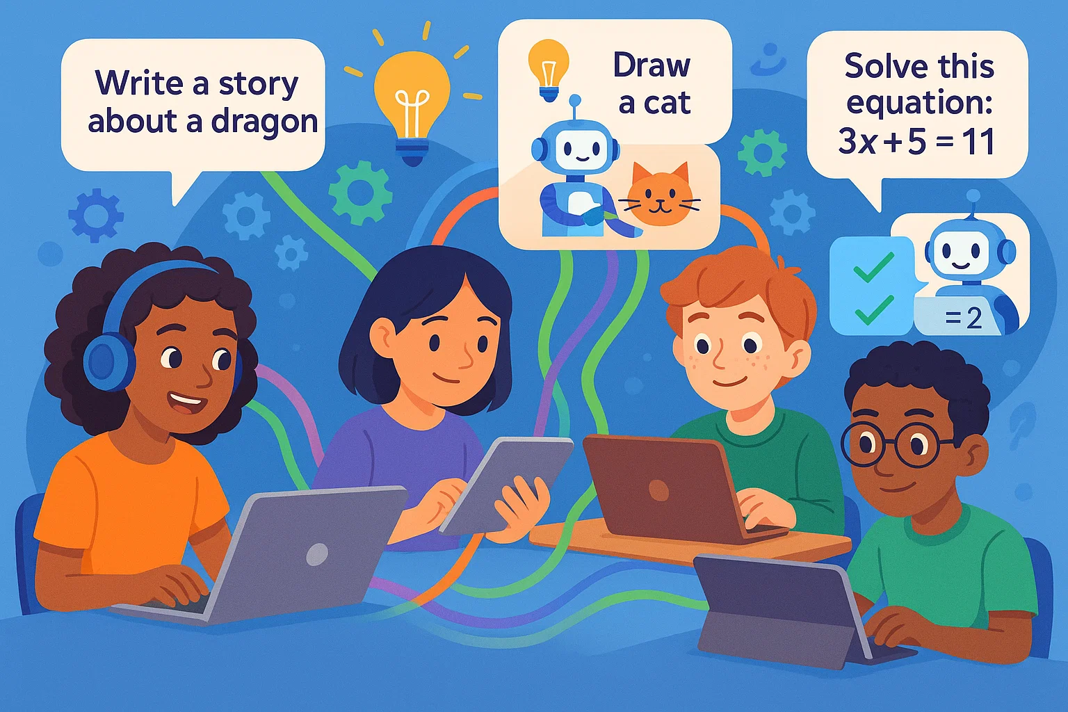
Ready to take your web development skills further? Explore our comprehensive coding programs for kids where young learners master HTML, CSS, and beyond through engaging, interactive lessons designed to build confidence and creativity.
