
Reading Time: 2 mins
Struggling to make your website look professional? You’re not alone. Many beginner web developers face frustration when their carefully crafted HTML structure looks plain and unappealing. Without proper styling, even the best-structured websites fall flat.
The solution lies in correctly linking CSS to HTML—yet this fundamental skill causes confusion for many developers. With improper linking, your styles won’t apply, leaving you with unstyled content and wasted development time.
In this comprehensive guide, I’ll show you exactly how to link CSS to HTML using three proven methods that I’ve refined over 15 years of web development. By the end, you’ll have the knowledge to create beautifully styled websites with clean, maintainable code.
Before diving into linking methods, let’s quickly understand what we’re working with.
CSS (Cascading Style Sheets) is a style sheet language that controls the presentation of HTML elements. While HTML provides the structure and content of your web page, CSS defines how that content looks—from colors and fonts to layouts and animations.
Linking CSS to HTML creates a separation of concerns, which offers several critical advantages:
Without this separation, you’d need to style each element individually within HTML, creating bloated, hard-to-maintain code.
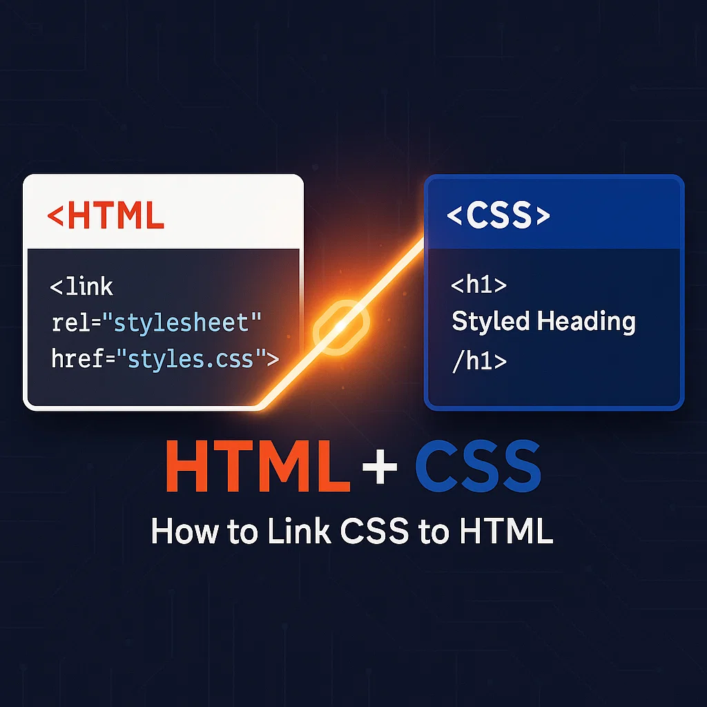
External CSS is the most widely used and recommended method for linking CSS to HTML. With this approach, you create a separate .css file and link it to your HTML document.
styles.css). Place this file in a dedicated folder named “css” or “styles” for better organization.body {
font-family: 'Arial', sans-serif;
margin: 0;
padding: 0;
background-color: #f5f5f5;
}
h1 {
color: #333;
text-align: center;
}
<head> section of your HTML document, add the <link> element:<!DOCTYPE html>
<html lang="en">
<head>
<meta charset="UTF-8">
<meta name="viewport" content="width=device-width, initial-scale=1.0">
<title>My Webpage</title>
<link rel="stylesheet" href="css/styles.css">
</head>
<body>
<h1>Welcome to My Website</h1>
<!-- Rest of your content -->
</body>
</html>
The href attribute specifies the path to your CSS file. This can be:
/css/styles.css)https://example.com/css/styles.css)In my experience working with large-scale websites, external CSS offers several advantages:
For more information on best practices for organizing your CSS files, check out our guide on shorthand properties in CSS to write more efficient code.
Internal CSS (also called embedded CSS) involves placing your CSS rules directly within the <style> element in the HTML document’s <head> section.
Add a <style> tag in the <head> section of your HTML document:
<!DOCTYPE html>
<html lang="en">
<head>
<meta charset="UTF-8">
<meta name="viewport" content="width=device-width, initial-scale=1.0">
<title>My Webpage</title>
<style>
body {
  font-family: 'Arial', sans-serif;
  margin: 0;
  padding: 0;
  background-color: #f5f5f5;
}

h1 {
  color: #333;
  text-align: center;
}
</style>
</head>
<body>
<h1>Welcome to My Website</h1>
<!-- Rest of your content -->
</body>
</html>
While external CSS is generally preferred, internal CSS has specific use cases:
The main drawback is that these styles can’t be reused across multiple pages, and the HTML file becomes larger and less maintainable.
For more on structuring your HTML documents efficiently, visit our guide on HTML boilerplate to get started with a solid foundation.
Inline CSS applies styles directly to individual HTML elements using the style attribute. This is the most specific way to apply CSS but should be used sparingly.
Add the style attribute directly to an HTML element:
<!DOCTYPE html>
<html lang="en">
<head>
  <meta charset="UTF-8">
  <meta name="viewport" content="width=device-width, initial-scale=1.0">
  <title>My Webpage</title>
</head>
<body>
  <h1 style="color: blue; text-align: center; font-size: 24px;">Welcome to My Website</h1>
  <p style="font-family: Arial; line-height: 1.6;">This paragraph has inline styling.</p>
  <!-- Rest of your content -->
</body>
</html>
In my 15 years of web development, I’ve found that inline CSS should be limited to specific scenarios:
<head> sectionInline CSS has significant downsides, including poor maintainability, code repetition, and difficulty in implementing responsive design. It also has the highest specificity, potentially causing style conflicts.
If you’re working with complex layouts, understanding the difference between div and span tags in HTML is crucial for proper CSS implementation.
After linking your CSS, organizing it effectively is crucial for maintainability. Here are expert practices I’ve developed over my career:
project/
├── index.html
├── about.html
├── css/
│   ├── main.css
│   ├── reset.css
│   └── components/
│       ├── header.css
│       └── footer.css
└── js/
    └── script.js
Consider using a methodology like BEM (Block, Element, Modifier), SMACSS, or OOCSS to structure your CSS rules consistently.
For example, using BEM:
/* Block */
.card {
  background: white;
  border-radius: 4px;
}

/* Element */
.card__title {
  font-size: 18px;
  font-weight: bold;
}

/* Modifier */
.card--featured {
  border: 2px solid gold;
}
:root {
  --primary-color: #3498db;
  --secondary-color: #2ecc71;
  --font-heading: 'Montserrat', sans-serif;
  --font-body: 'Open Sans', sans-serif;
}

h1 {
  color: var(--primary-color);
  font-family: var(--font-heading);
}
/* Base styles for mobile */
.container {
  width: 100%;
  padding: 10px;
}

/* Tablet styles */
@media (min-width: 768px) {
  .container {
    width: 750px;
    padding: 20px;
  }
}

/* Desktop styles */
@media (min-width: 1024px) {
  .container {
    width: 970px;
    padding: 30px;
  }
}
For more on creating responsive designs, learn how to add background images in CSS that adapt to different screen sizes.
Even experienced developers encounter CSS linking issues. Here are solutions to the most common problems:
Problem: Your styles aren’t being applied to the HTML elements.
Solutions:
<link> tag is in the <head> sectionProblem: Some styles are being overridden unexpectedly.
Solution: Understand CSS specificity hierarchy:
Problem: Relative paths not working correctly.
Solutions:
href="styles.css"href="css/styles.css"href="../styles.css"href="/css/styles.css"Problem: Responsive designs not working correctly.
Solution: Ensure your HTML includes the viewport meta tag:
<meta name="viewport" content="width=device-width, initial-scale=1.0">
For smooth interactions, check out our guide on how to add a smooth hover in CSS to enhance your user experience.
Once you’ve mastered the basics, these advanced techniques will elevate your CSS implementation:
The <link> element accepts a media attribute to load different stylesheets based on device characteristics:
<!-- Default styles -->
<link rel="stylesheet" href="css/styles.css">

<!-- Print-specific styles -->
<link rel="stylesheet" href="css/print.css" media="print">

<!-- Mobile-specific styles -->
<link rel="stylesheet" href="css/mobile.css" media="screen and (max-width: 768px)">
Improve performance by preloading critical CSS:
<link rel="preload" href="css/critical.css" as="style">
<link rel="stylesheet" href="css/critical.css">
Provide user-selectable theme options:
<link rel="stylesheet" href="css/default.css" title="Default">
<link rel="alternate stylesheet" href="css/dark.css" title="Dark Mode">
<link rel="alternate stylesheet" href="css/high-contrast.css" title="High Contrast">
:root {
  --primary-color: #3498db;
}

[data-theme="dark"] {
  --primary-color: #2980b9;
}

body {
  background-color: var(--primary-color);
}
function loadStylesheet(url) {
  const link = document.createElement('link');
  link.rel = 'stylesheet';
  link.href = url;
  document.head.appendChild(link);
}

// Load CSS based on user preference
if (userPrefersDarkMode) {
  loadStylesheet('css/dark.css');
}
To understand more about working with HTML and CSS together, explore our guide on what is a div tag in HTML and how it serves as the foundation for CSS styling.
Ensure your CSS is properly linked with these tools:
Press F12 in most browsers to access Developer Tools, then:
Google’s Lighthouse (built into Chrome DevTools) analyzes:
For more efficient web development, check out our guide on VS Code shortcut keys for web developers to speed up your workflow.
External CSS lives in a separate file and is linked to HTML, internal CSS is placed within <style> tags in the HTML document’s head, and inline CSS is applied directly to HTML elements using the style attribute. External CSS is best for maintainability and performance across multiple pages.
Yes! You can link multiple CSS files using separate <link> elements. This is a common practice for organizing styles (e.g., having reset.css, components.css, and layout.css).
<link rel="stylesheet" href="css/reset.css">
<link rel="stylesheet" href="css/layout.css">
<link rel="stylesheet" href="css/components.css">
That’s the beauty of external CSS—you can modify your stylesheet without touching the HTML files. Just edit your .css file, and the changes will apply to all linked HTML documents on the next page load.
CSS follows a cascading order, so later styles override earlier ones with the same specificity. Link your files in order of increasing specificity: reset/normalize CSS first, then global styles, followed by component styles, and finally page-specific styles.
Yes, you can link to external CSS files using their full URLs:
<link rel="stylesheet" href="https://cdn.example.com/css/framework.css">
This is common when using CSS frameworks like Bootstrap or when loading fonts from Google Fonts.
Linking CSS to HTML is fundamental to creating beautiful, maintainable websites. In this guide, we’ve covered:
Remember that external CSS is the recommended approach for most projects, offering the best balance of performance and maintainability. Internal CSS works well for single-page applications, while inline CSS should be reserved for special cases.
By properly separating your HTML structure from CSS presentation, you’ll create more efficient, maintainable, and professional websites that are easier to update and scale as your projects grow.
Ready to take your web development skills further? Check out our guides on how to change font size in HTML and CSS or learn about the differences between HTML4 and HTML5 to stay current with web standards.
Start applying these techniques today, and you’ll see immediate improvements in your web development workflow!
